Case Study: El Cerrito

Introduction
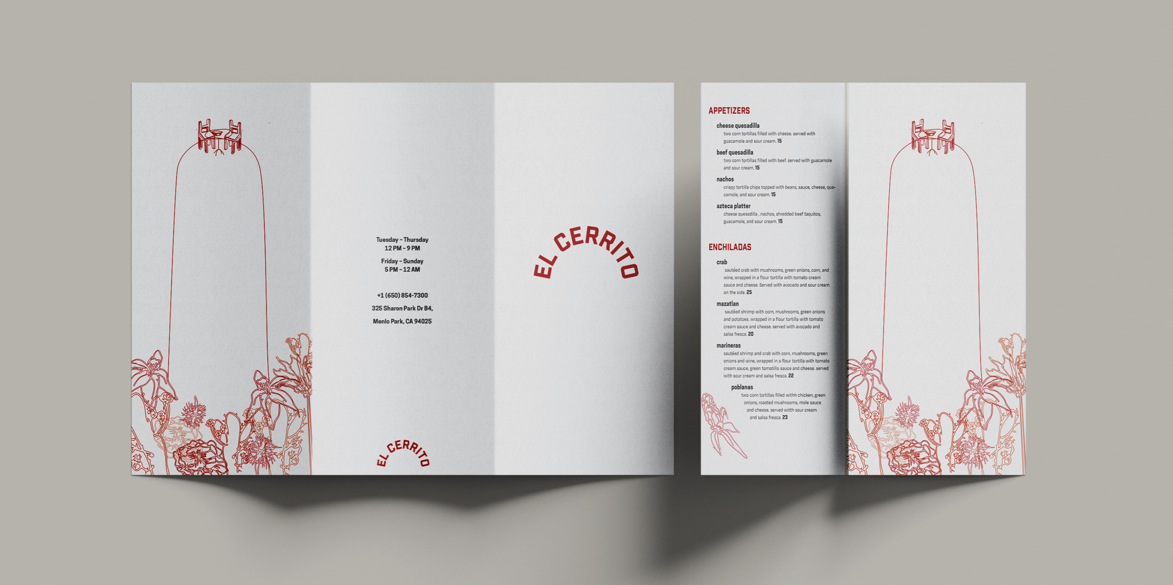
The goal of this project was to rebrand a local restaurant and elevate its identity with a more high-end expression. A collateral system with the menu as the primary focus was also designed. A challenge was that the menu had to be in the unconventional 11“x17” multifold format. The restaurant I chose to rebrand was the Menlo Park based restaurant El Cerrito. Following the design process, considering the material, color, typography, layout, and illustrations resulted in a simple yet effective visual language that elevated the impression through details.

Research
As the first step in the design process, I visited the restaurant and researched the food culture. The name El Cerrito translates to “the little hill,” which was the inspiration for the logo – the wordmark logo is shaped like a hill. The hill was repeated on the crossover page as well. The visual research included a lot of edible plants and flowers, desserts, and simple dinner seating for two.


Result
The result was a design system that conveys the care only a small-scale business can give. It also conveys the time and effort through individual illustrations, and the red brings the warmth that you experience when visiting the restaurant, as well as highlighting the Mexican cuisine. This project taught me how to build a cohesive system across multiple formats and prioritize usability without compromising visual identity.


Reflection
This rebranding project challenged me to develop a personal design language while maintaining an elevated aesthetic. The unconventional menu size required consideration in order to not create

