Case Study: Fibershed

The goal of this project was to create a rebrand for Fibershed, a nonprofit organization working to develop sustainable solutions and systems for textile production and dye methods. The rebrand was presented through a branding style guide for designers at the organization to help them uphold the brand voice. The guide explains the thought process behind my design choices, detailing the logo design, typography usage, color palettes, grid systems, and photography guidelines. It concludes with examples that showcase how the new branding can be implemented in different ways.
Research
The visual research behind this project was crucial in determining whether I wanted to approach the rebrand with a more traditional or innovative tone. I created four different moodboards highlighting either agriculture or innovation. I realized that both topics reflected the equal importance of the two different sides of the organization. I chose to merge the two moodboards on this side and have them represent the different parts of their work. I wanted to capture the majestic and dramatic landscape through imagery, as well as the personal, DIY aspect of their workshops and technique development in a more handcrafted way.


Logo Development
The logo showcases a tilted and modified F that evokes the image of two mountain tops, emphasizing their connection to Point Reyes. The text draws inspiration from dye bleed, adding to the dynamic feel. In the initial vectorized iterations, the logo appeared either very abstract or sharp. Given Fibershed’s commitment to sustainability and nature, I focused on designing a softer, more organic shape that truly reflects those values.

Grid Systems
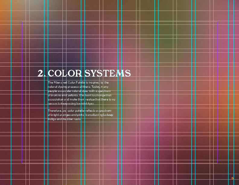
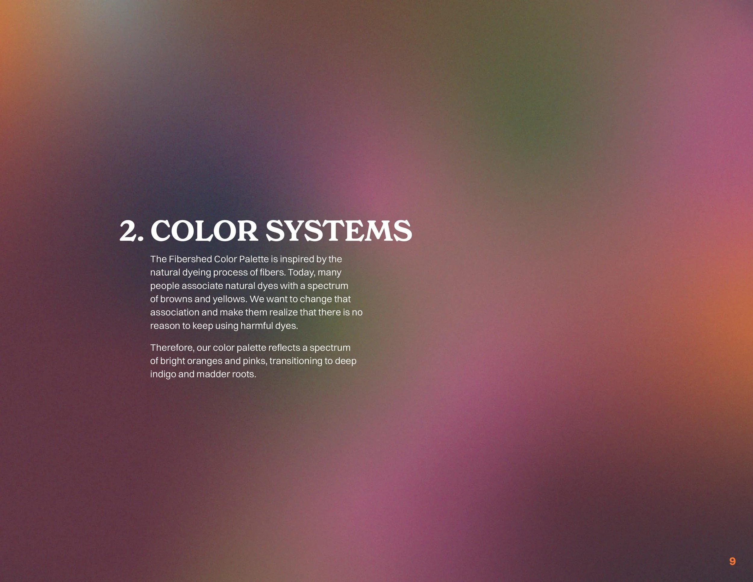
I used a 1” margin with a 12x12 grid. This grid made it possible to ensure maximum versatility without risking that those elements would jump around on different pages depending on the page layout. My goal for the layout was to make it feel easy to read and avoid being an experimental design element, as the text is an instruction that the user must follow. The entire 30-page document includes five layout options, but the two shown in this image are the two foundational layouts.
Page with 12x12 grid
Page without grid

Page with 12x12 grid

Page without grid
Reflection
The outcome was a cohesive 30-page style guide that guides designers in maintaining the right brand voice while designing. The guide demonstrates how to create highly curated materials, as well as the everyday documentation and marketing that is frequently updated on their website and social media, for example. Everything – from the logo and color to typography and imagery - communicates a fresh take on an
very bohemian visual culture.
Click-through Style Guide
